Rachael Wilson
Racial segregation by neighborhood has persisted in Chicago since the end of WW I, when blacks from the southern United States moved northward seeking jobs. Segregated neighborhoods quickly arose due to discriminatory housing policies such as restrictive covenants that “forbade white property owners to rent or sell to blacks” (Bogira, 2011) and “red lining,” in which blacks were denied mortgages for housing in more affluent white neighborhoods. (Seitles, 1996) Hostility towards blacks who attempted to move into white neighborhoods and white flight to the suburbs also greatly contributed to segregation. Many of Chicago’s biggest employers moved to the suburbs as well. Due to these barriers, unemployment and poverty grew in the areas in the south and west sides where blacks were concentrated. (Bogira, 2011) A recent civic report by Edward Glaeser and Jacob Vigdor from the Manhattan Institute for Policy Research has identified Chicago as the most racially segregated city in the United States. However, the report highlights a trend of declining segregation across the US, with Chicago experiencing the second largest decline. The report used the dissimilarity index and the isolation index to measure segregation. According to the report, the dissimilarity index measures the extent to which two groups are found in equal proportion in all neighborhoods. The isolation index measures the tendency for members of one race to live in neighborhoods where their share of the population is above the citywide average.
For my study, I employed ArcGIS as an alternative method to analyze racial distribution in Chicago. I used distance measurement and descriptive spatial statistics to examine the change in distribution of blacks and whites across census tracts from 1970 to 2010 in ten-year increments. This study is important because it aims to identify trends in the distribution of the two largest racial groups in Chicago over time and whether these trends indicate decreasing, increasing, or unchanging neighborhood segregation in Chicago.
In order to map changes in the distribution of black and white races in Chicago from the years 2000 and 2010, I downloaded census data detailing population by race in census tracts from factfinder2.census.gov. To obtain data from 1990, 1980 and 1970, I used the Neighborhood Change Database of Geolytics.
For each map, I used the mean center and standard distance tools to analyze the distribution of blacks and whites. The mean center tool is useful for tracking changes and comparing distributions. It generates a point on a map for a particular feature by taking the average x and y coordinates of that feature’s centroids. The mean center can be unweighted or weighted. With the tool, I created two weighted mean center points for each map, one was weighted with the total population of blacks and one weighted with the total population of whites. The mean center points of the black and white populations demonstrated where both populations were most concentrated. I created these points because I wanted to measure the distance between them. If the white and black mean center points were to move closer to one another over time, this would indicate a decrease in segregation. If the points were to move farther away from one another, this would indicate an increase in segregation. After creating the mean center points, I used the point distance tool to measure the distance between the black and white mean center points. This tool produced a table that displayed the distance in feet between the white and black mean centers.
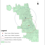
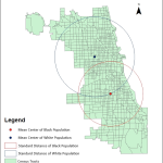
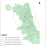
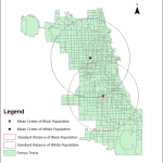
After measuring the distance between the mean centers for each map, I used the standard distance tool in order to measure the distribution of both races in each map. The standard distance tool measures compactness of a distribution and is useful for comparing distributions and identifying service areas and concentrations. It is a circle with its center at the mean and the radius representing the standard distance (the corollary to a standard deviation measure for numerical distributions). Like the mean center, standard distance can be weighted or unweighted. I created two weighted standard distance circles for each map, one representing the distribution of blacks and one representing the distribution of whites. I created the circles in order to compare the distribution of blacks and whites across time. If the radii of the circles were to increase over time, this would indicate a wider dispersal and decreasing segregation. If the radii were to decrease, this would indicate that the races were more concentrated in a certain area, signifying increasing segregation. The results of applying these tools to each map are shown below.
 1970 1970 |
 1980 1980 |
 1990 1990 |
 2000 2000 |
 2010 2010 |
The table below shows the data generated by applying the mean center and standard distance tools to the maps of Chicago from 1970-2010.
| Distance Between Black and White Mean Centers in Feet | Standard Distance of Black Population in Feet | Standard Distance of White Population in Feet | |
| 1970 | 29,579.33 | 25,942.49 | 38,190.26 |
| 1980 | 37,650.12 | 30,289.82 | 37,314.77 |
| 1990 | 37,145.95 | 25,942.49 | 38,190.26 |
| 2000 | 38,160.38 | 33,664.07 | 35,703.99 |
| 2010 | 37,655.51 | 32,996.90 | 37,067.29 |
The maps show that the mean center points for black and white populations are still concentrated in the same general areas that they were in 1970. As shown in the table, the mean center points have actually moved 8086.18 ft away from one another since 1970, signifying increasing segregation. The standard distance for the black population has increased 8,076.18 feet since 1970, indicating a wider dispersal of blacks throughout Chicago and implying a rise in integration. However, the increase in the standard distance of the black population has not been consistent and has decreased by 404.87 feet since 2000. The standard distance for the white population has remained relatively stagnant since 1970. 2000-2010 saw its largest increase of 1,363.3 feet. Overall, the increase in the standard distance of the black population since 1970 shows evidence of an increase in integration. However, the increase in the distance between the mean centers of the black and white populations and the fact that they have remained in the same general areas since 1970 illustrate continuing segregation.
The mixed results from my study have lead me to conclude that although change has occurred since 1970, much more has to be done in order to achieve meaningful change in the amount of racial segregation by neighborhood in Chicago. According to the 1996 paper by Marc Seitles, creating policies that promote inclusionary zoning practices that set aside a certain percent of new housing developments for affordable housing units could be a step toward integration. Legal systems that discourage non-compliance to these zoning practices could also be implemented. Furthermore, mobility programs that provide opportunities to minority individuals and families to relocate to areas where their race does not predominate are also a potential means to increase integration in the city.
Works Cited:
Glaeser, E., & Vigdor, J. (2012). The End of the Segregated Century: Racial Separation in America’s Neighborhoods, 1890-2010. New York, NY: Manhattan Institute for Policy Research
Bogira, S. (2011). Separate, Unequal, and Ignored Racial segregation remains Chicago’s most fundamental problem. Why isn’t it an issue in the mayor’s race?The Chicago Reader.
Seitles, M. (1998). Perpetuation of Residential Racial Segregation in America: Historical Discrimination, Modern Forms of Exclusion, and Inclusionary Remedies, Journal of Land Use and Environmental Law, 14, 89.
Contact: RJWILSO2(AT)ILLINOIS(DOT)EDU
Disclaimer: This study was conducted as part of a course requirement for UP 418 (GIS for Planners) at the University of Illinois at Urbana-Champaign. As a class project it may lack analytic rigor, data accuracy, and validity. Findings of this study can only be shared, disseminated, or reproduced after getting consent from the student and the instructor.
